Why Your Brand Needs Logo Alternatives
Alternate logo. Submark. Icons. You may have never come across these terms until it was time to brand your new biz. Maybe you've herd of them but never really considered their importance or understood why they’re so useful…In this post, we’ll break down each logo alternative and common uses for them in your business. We believe it’s so important to brand your business right from the start, ensuring you have all the elements you need to truly make your brand stand out across any platform!
Why you need them…
Having one single logo to represent your business is not always practical. You’ll most likely find your primary logo isn’t suitable for certain mediums and purposes. This is why we offer our Brand Suite Package, so that we can deliver a complete logo package that provides you with variations to suit any space or medium you come across in your business. Think about all the print and online materials you will need to put your logo on… The logo you use for your instagram profile will most likely be different to the logo you put on your swing tags.
Your alternative logos are derived from your primary logo. They’re not completely different designs but restructured layouts that keep the same fonts, colours and style as your primary logo. At The Design Parlour, we work to ensure consistency through out your brand suite and want you to feel confident in that your branding is fit for all purpose you’ll come across in your business journey!
The different logo types and common uses….
Primary Logo
This is your main logo that sets the tone for the alternative layouts. It is often in the form of a complete wordmark, including all text and graphics. Often they’re seen in horizontal form, not stacked. Commonly used for your website, swing tags, mail outs, shipping/shopping bags.

Alternate logo
This is a variation on the layout of your primary logo and is often seen stacked. This is usually so the wordmark can fit into tighter spaces, or spaces that don’t allow for such a horizontal layout.
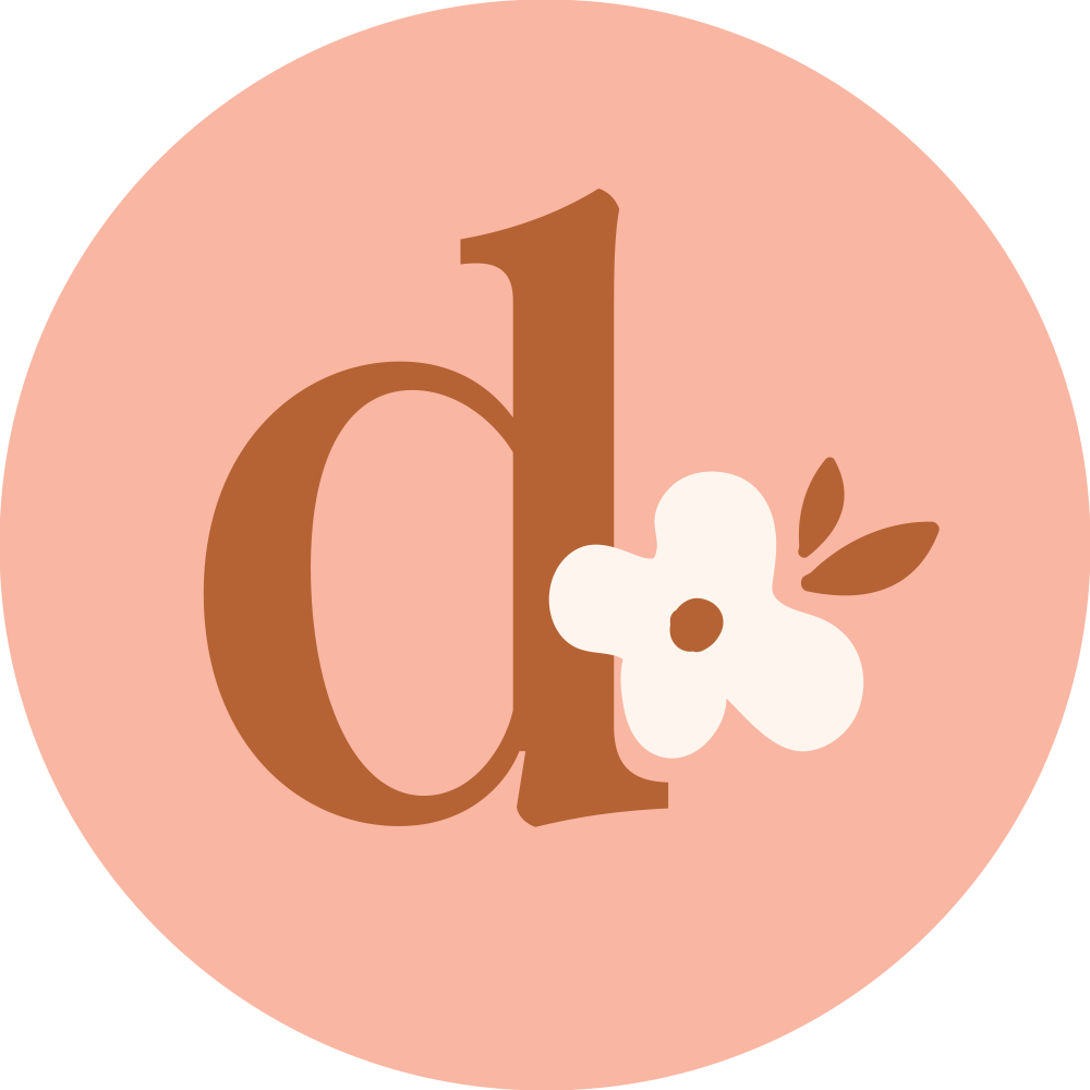
Submark
Submarks are great to have in your branding- they’re almost like little punchy graphics that represent your brand. They often utilise a lettermark, make use of your brand graphic or shapes such as circles. Submarks are great to fit in small spaces such as Instagram profile pictures or email signature. We use ours often and I think it’s my favourite element of The Design Parlour Branding!

Icons
These are simple, small graphics- almost like a reduced down version of your submark. It often doesn't involve much text at all, just a lettermark or graphic. Commonly, they're used for your website favicon. We use ours for our Instagram profile picture because we wanted it to be clear and bold in the small space.
Apart from providing you with each alternative logo design, we also provide you with various colour options and files formats for different uses. For example, we provide you with PNG files that have transparent backgrounds, suitable for uploading online.
We also provide you with a brand board which lays out each logo variation, clearly labeled, along with fonts and colour palettes. This is so you or anyone else in your business can understand how to use the logo and gain a good understanding of your brand aesthetic.